
13 Nov On The Map: 2020-01
They say that imitation is the sincerest form of flattery. This is true even in the world of data visualization.
I have long been a big fan of the data visualizations that the website FiveThirtyEight creates for its stories. Their maps and charts are clean, simple, and modern, with interesting font choices and color schemes. 538’s design is so visually appealing that the style is iconic at this point, in my opinion.
Here is an example of one of 538’s charts that I used as a template in a exercise to create a chart of some other data:
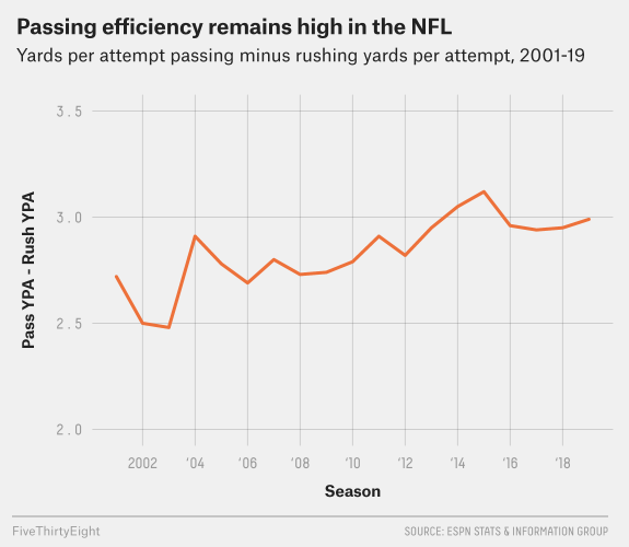
Nevermind the content of this chart. We want to replicate its style.
Doing so involved a lot of code writing using the programming language Python, a Jupyter Notebook for writing and testing the code, and a library for generating and customizing the chart. In this case, I used Seaborn to design and plot the graphic.
(It should be noted that Seaborn does have a built-in style called FiveThirtyEight, but I opted to do this the hard way. As usual!)
After much trial and error, I was able to produce this chart of the parcel mapping progress at the St. Tammany Parish Assessor’s Office since 2014:
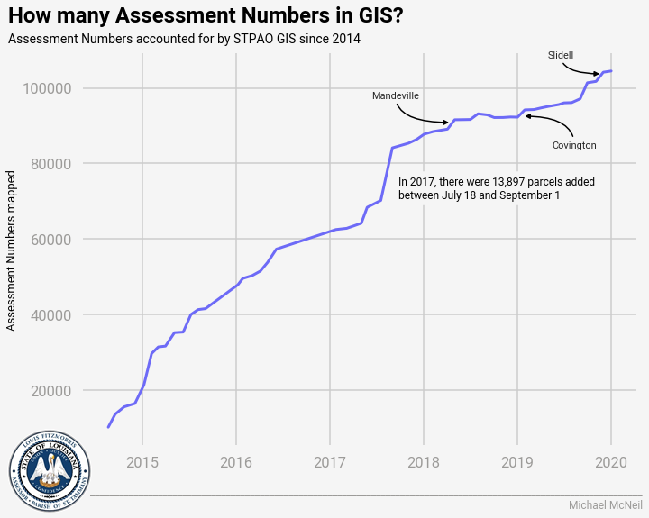
While it certainly is not an exact replica — I used a different font and color scheme, added the Assessor’s logo, and used a rectangular aspect ratio — it is a proximate duplication of FiveThirtyEight’s style.
When you see a style that you like in the wild, be it for a map or a chart or anything else, trying to replicate it using your skills and the tools available to you can be a challenging and rewarding exercise. Remember, imitation is flattery!
What comes out the other end of your process may look like a ripoff at first. But as you continue to develop and learn and iterate over time, you will end up creating a custom style all your own.
Not to mention how the quality of your work, and your self, will improve as you keep trying to get better.
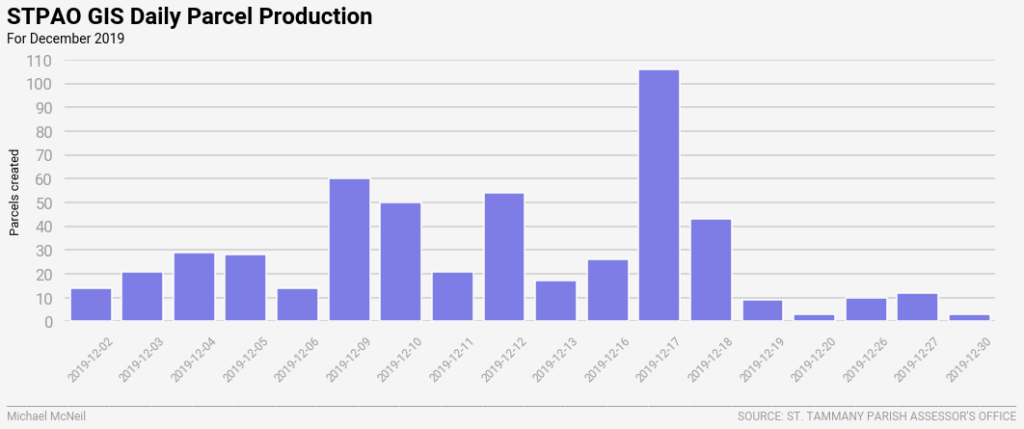
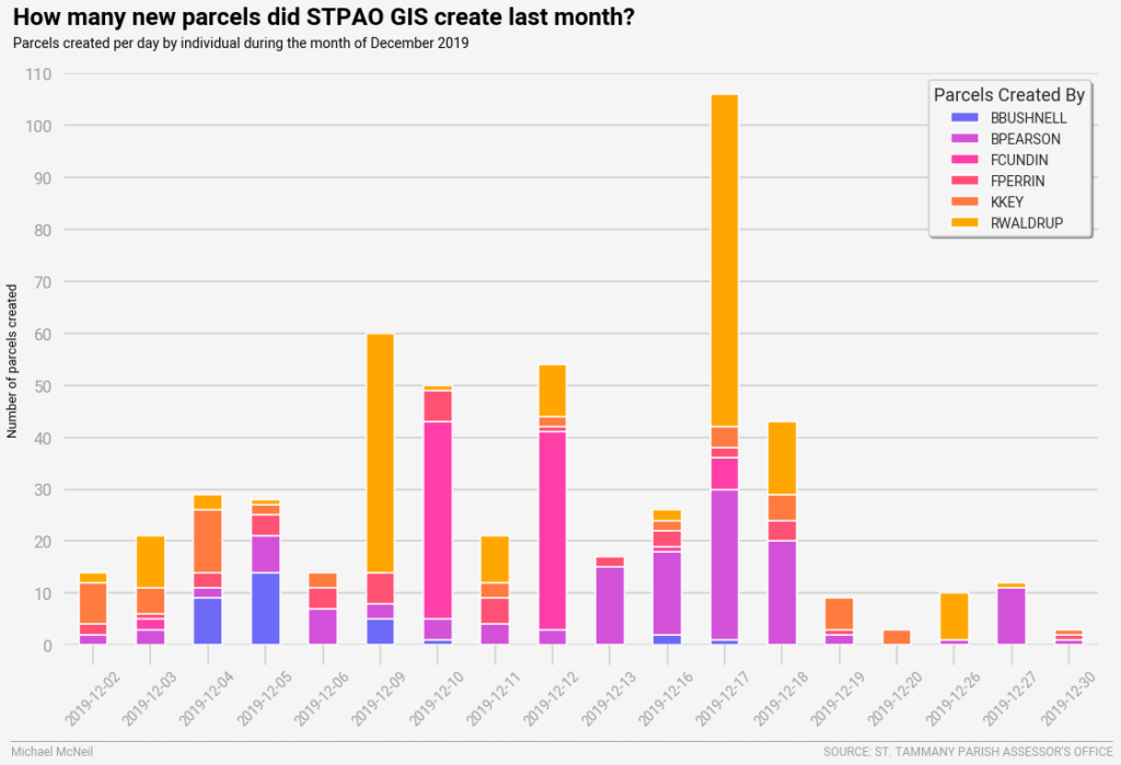
STPAO CHART STYLE
Now that we created a unique style for STPAO data visualizations (see above), that style can be applied to all our charts.
Like this one …
… and this one:
Creating a unique style and applying it to your products is important because it makes your products look cohesive. The style is purposeful and becomes recognizable by your audience. Over time, there is no mistaking your products for someone else’s.
Your style becomes iconic, which is why using the same style consistently over time is important. It represents your organization, and in this way everything you create with that style becomes your organization.